CommandCTRL Product Design
A ground-up UI/UX redesign of Liquidware’s real-time endpoint diagnostics platform: we took a dense, powerful product and gave it a modern, legible interface without stripping any of its depth.
Explore the product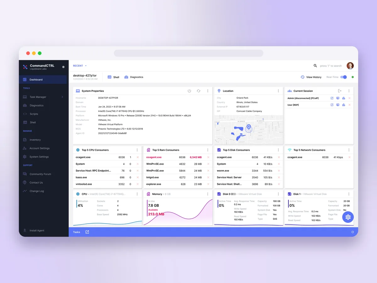
Liquidware
Web application · SaaS
Product design (UI/UX), design system
The challenge
CommandCTRL is a genuinely deep product. It streams live telemetry from every managed endpoint — CPU, memory, disk, network, processes, sessions, even location — and stacks remediation tools on top: a remote shell, diagnostics, a script library, and a DVR-style history you can scrub back through. All of that power lived behind an interface that had grown organically and started to show its age. Liquidware came to us before the marketing site existed, with a single brief: modernize the product itself. Keep every capability, lose the clutter, and make a room full of data feel calm and immediate.
What we redesigned
We redesigned the entire product surface, starting with the dashboard the whole tool orbits. Machine telemetry is organized into a clean card grid — system properties, live location, current sessions, and the top CPU, memory, disk, and network consumers — with real-time sparkline charts that make a spike obvious at a glance. A time-scrubber across the top lets an admin slide between live monitoring and any moment in a machine’s recorded history, with a Real-Time toggle, playback controls, and a calendar for jumping straight to a specific day.
The redesign carries through the product’s full toolset: Task Manager, Diagnostics, Scripts, Shell, and Inventory, plus account and system settings — all sharing one navigation model, one component library, and both a light and a fully considered dark theme.
A system, not a reskin
Rather than restyle screens one at a time, we built the redesign as a design system: a deliberate type scale, a restrained palette anchored by a single vivid accent, and consistent cards, tables, controls, and states that Liquidware’s team could extend across a product that keeps growing. Dense diagnostic tables, status pills, and data-heavy panels all draw from the same kit, so new tools look native on arrival instead of bolted on.
CommandCTRL does a lot more than one dashboard can show. You can explore the full breadth of the platform on the product site we later built for it.
Accessible by design
An operations console is only as good as it is in a dim NOC at 2 a.m. The redesign was drawn to hold up under real conditions: contrast-checked color for long shifts, type that stays legible at the small sizes dense telemetry demands, clear focus and hover states, and a dark theme that is a first-class citizen rather than an afterthought. Status is never carried by color alone, so a spiking process reads whether or not you can tell red from green.