Every Day is a Good Day
Every Day is a Good Day is a full journaling product for wellbeing and cognitive-rehabilitation settings. People keep private entries with photos, get reminded of past moments, tag the people in their lives, and share memories when they choose to, all backed by real subscription billing. It works the same on the web and on a phone, and we designed and built the whole thing.
Visit everydayisagoodday.co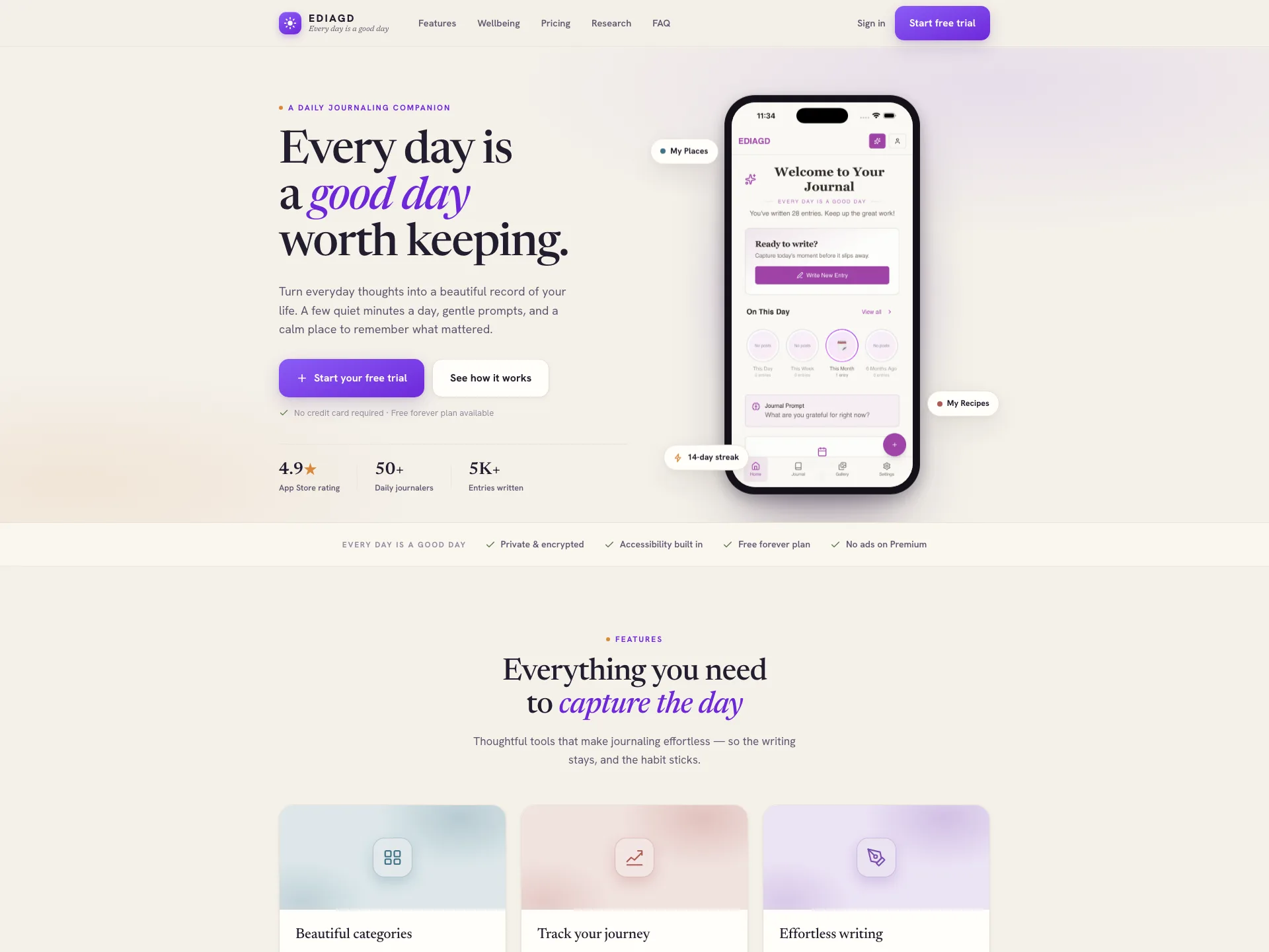
Every Day is a Good Day
Web app + mobile
Product design, full-stack development, payments & security
The challenge
Journaling apps live or die on whether people come back, so writing had to feel easy on the first day and still worth it a month in. At the same time this needed to be a real product, with private accounts, paid plans, photos, and memories people could share. All of it had to work the same way on a phone and in a browser without becoming two separate apps to keep in sync. Most of the work went into making something that big feel simple.
One product, everywhere
We built it as one product that runs on the web and on phones from the same core, so anything someone does on their phone is already waiting when they open a browser. There is no second-rate mobile version trailing behind the real one. This is a large application too, not a quick prototype. It runs to dozens of screens with a full account system behind them.
The writing side goes well beyond a blank page. Entries sort into categories and can hold photos. An "On This Day" feature resurfaces memories from past years on the date they happened. People can tag the friends and family who show up in their entries and pull up everything connected to a person at once. Any entry can also become a private link to share with someone, and that link can be switched off again at any time.
Private by default, and audited
Everything someone writes stays private to their account, and that privacy lives in the foundation of the app rather than being hidden away in the interface. An entry only becomes visible to anyone else when its owner decides to share it. Photos are handled the same way. They sit in private storage, load through links that expire on their own, and come from the app’s own web address, so nothing ever looks like it is parked on someone else’s service.
We also went looking for our own mistakes. A formal security review turned up a flaw that could have let a user quietly give themselves a paid plan for free, and we closed it before it could ever be used, then wrote up exactly what happened so it would stay fixed. That kind of care matters on a product trusted with private thoughts and card details.
A complete subscription business
The billing is a full subscription system rather than a single pay button. There are free trials, promo codes, upgrades and downgrades, and a self-serve area where customers manage their own plan. It is also built to be forgiving. A stray double-click, a dropped connection, or a refreshed page will not double-charge anyone or unlock access by accident. All of it runs on Stripe, so payments stay secure and reliable.
Accessibility built around the person
The app is meant for wellbeing and cognitive-rehabilitation use, so accessibility shaped it from the start rather than getting bolted on later. The whole layout can flip to match whether someone is left-handed or right-handed and which eye they favor, and that choice stays with them on every screen. It also holds to recognized accessibility standards across the board, working with keyboards and screen readers and staying easy to read, so the daily habit works for the people who need it most.